Logo Design Services
Build trust in your brand with inspired design.


Be recognized at a glance!
Your logo is the first thing someone sees in relation to your brand—the backbone of your corporate identity and the face of your business. Logos make a business easily identifiable, and visually set them apart. A well designed logo should be memorable, scalable, and relevant to the audience in order for it to be truly effective. The designers here at Green Group Studio are accomplished in working with each client to deliver a logo that is successful in meeting business goals and achieving brand recognition. Having a good logo is the first step, and we can help you implement your logo across various media such as business cards, brochures, corporate identity packages, and a killer website.
Logo Design Clients
Additional work samples


Types of Logos
Choosing a creative and effective logo that best represents your company’s products, services, and character is central to its overall success. Whether showcased on window signage, business cards, brochures, stationary, billboards, commercials, or any medium in between, your logo helps to immediately identify your brand to current and potential customers. Take a moment and think of the world’s industry-leading brands: Apple, Google, Fed-Ex, Starbucks. These companies have logos that both customers and non-customers can recognize no matter where they are, what demographic they fall into, or what their interests are. Below are the four most common types of logos used by some of the world’s most recognizable brands.
The Wordmark or Logotype (Text)
The wordmark is a distinct, text-only typographical treatment of the name of a company. This logo style is widely considered to be the simplest and most popular of the different types of logos. The creativity and uniqueness of wordmarks come out through the font type, size, text positioning, and color(s) used. Wordmarks are the preferred style for those companies whose name describes what they do, for those who have a unique name, or for those who want to increase their brand awareness. Notable companies with wordmark logos include FedEx, Coca-Cola, Sharpie, and Google.
The Lettermark or Signature (Initials or Abbreviations)
Lettermark logos are also text-only logos that typically display the initials or abbreviation of the company’s name. These types of logos are essentially used as a symbol to represent the company, and are often the preferred choice for those companies whose name is long, difficult to pronounce, or has many words. Popular examples of lettermark logos include Louis Vuitton (LV), Home Box Office (HBO), and Electronic Arts (EA).
The Brandmark (Symbol or Icon)
Brandmarks are simple, yet abstract, icons or symbols used to represent a company without the use of words. Small and/or new businesses should stay away from using a brandmark logo as they have not yet developed (or simply don’t intent to) the brand presence necessary to be recognizable to customers based only on their brandmark logo. The main benefit of using a brandmark logo for large companies with a global presence is that the symbol is recognizable no matter what country it is displayed or what language the viewer speaks. Famous companies who take advantage of a brandmark logo are Apple, NIKE, and Target.
The Emblem, Badge, Shield, or Seal (Text Within a Symbol)
An emblem logo involves the company or organization’s name being incorporated within the design. These types of logos are derived from the historic use of family crests, making them the go-to option for high-end or iconic brands like Porsche, Starbucks (before the makeover), and the United States Navy. The downside to using an emblem logo is that they are considerably inflexible because the text and symbol are often virtually inseparable.
The Combination Mark (Text & Symbol)
The combination mark is a hybrid of the wordmark and brandmark logo types, that combines the use of text with a symbol. The combination mark is the most popular logo type among companies (especially small businesses) because it allows them the flexibility of using the elements together, or apart. An added benefit of the combination mark is that it allows companies with similar symbols to differentiate themselves based on the presence of their company’s name. In order to create an effective combination mark, both the text and the symbol should be able to stand on their own. Some notable combination marks include those used by Xbox 360, Adidas, and Macy’s.
Choosing a Style for your Logo
Another thing to keep in mind when choosing a logo style is the character of your brand and how that relates to your logo. For example, a whimsical logo wouldn’t be the most appropriate fit for a financial institution or any other company trying to exude professionalism and trustworthiness. Your logo needs to speak to your customers, and should be used as a tool to express your company’s personality and overall direction.
At Green Group Studio, we offer a number of different logo design packages created to fit a range of budgets and goals. If you're interested in finding out more about logo design packages, email us here or call 561-594-7336 to speak with one of our graphic designers.
Prefer to schedule a call, click here
Tips & Guidelines for the Use of Color in Logos
Using Pantone Colors
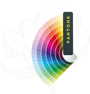
In order to understand the importance of using Pantone colors when creating your logo, you must first understand the differences between the CMYK and Pantone printing processes. During the CMYK printing process, the colors used in a file are separated into four primary colors: cyan, magenta, yellow, and key (black). CMYK colors are simulated colors that are not pre-mixed and, therefore, work within a small but certain margin of inaccuracy. In contrast, the Pantone or PMS (Pantone Matching System) color printing process uses a particular group of colors that will accurately reproduce when printed, every time. Since Pantone colors are pre-mixed published colors with an existing selection of colors, they are the preferred printing process for logo and print designers.
How Many Colors Should a Logo Have?
When choosing color options for a logo, the risk of using too many colors is greater than the risk of using too few. When choosing a color scheme, going with three colors either in a monochromatic or triadic color scheme is your best bet for a well-balanced logo.
The three-color logo design theory is made up of the primary color (which covers about 60% of the space and should be the safest part of the logo), a complimentary secondary color (which covers about 30% of the logo to create visual interest), and the accent color (which covers about 10% of the logo to provide a sense of variety.
Below are a few key things to keep in mind when choosing colors for your logo:
The Psychology of Color in Logos
Understanding your customers’ subconscious emotional connections to different colors is imperative when it comes to choosing the color(s) of your logo. Research shows that a majority of people make up their minds about purchasing a product within 90 seconds of their initial interaction with the product, with about 62-90 percent of their assessment based on color alone. In regards to the role that color plays in marketing, the relationship between a brand and its chosen color(s) hinges on the perceived appropriateness of the color being used for the particular product(s) that the brand sells. For example, hair product companies typically use bright colors in their logos and packaging to stand out from the competition on cluttered store shelves while organic product companies typically stick to muted, earthy colors to promote their environmental focus.

The Logo Design Process
The logo design process consists of three parts: idea generation, refinement, and design. Idea generation is the process of taking the client-provided parameters and coming up with as many ideas as possible within a pre-determined timeframe. The refinement portion consists of figuring out which ideas best suit the client’s needs and then refining them. The graphic design process brings it all together in a client-ready file for final review.
The Green Group Studio Logo Design Process

At Green Group Studio, our logo design process starts by having a discussion with the client to find out if they need a new logo, a logo redesign, or a logo revision. For new companies without existing marketing materials, we then offer them assistance with developing their brand identity (see our Corporate Identity Package) as a whole, this includes making sure that everything from their business cards, brochures, trade show displays, and website remain consistent across all channels.
The next step in the logo design process is identifying the specific goals of the company. By communicating openly with our clients, we identify important information like the industry and target audience so that our designers can craft a logo that totally fulfills their visions. Is your company business-to-business or business-to-customer? Are you trying to reach out to a specific age group or gender? What are your target market’s interests? These are just a few of the types of questions our professionals ask in our free logo consultation.
Once we have the goals and audience of your company’s logo nailed down, we begin brainstorming concepts. Is there specific imagery that comes to mind, or perhaps a specific direction the client is hoping to see? What are the branding opportunities different designs offer? Different clients have different needs and expectations. Green Group Studio’s logo design packages include three logo design concepts and up to two rounds of revisions on the selected concepts.
If you’re looking for a logo design, redesign, or update, call us today at (561) 594-7336 for a free consultation with one of our logo design professionals. Green Group Studio offers several comprehensive logo design packages designed to fit every budget and goal.

What is Screen Printing & Why is it Important When Designing your Logo?
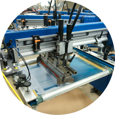
A printing method utilized by textile manufacturers, the screen printing process allows apparel printing companies to transfer images, text, and logos onto fabric through the use of a mesh screen. When designing your logo, it is important to keep in mind the overall size and level of detail, and how that will ultimately affect how it is displayed on everything from business cards and letterheads, to trade show displays and promotional items. In the case of intricately designed logos, creating an alternate version of your logo with a reduced level of detail can be beneficial for those times when it is displayed at a smaller scale. This can greatly enhance your logo’s legibility and, in turn, retain its effectiveness regardless of the medium it is applied to.
Why Vectors?
Most graphic designers use one of the two vector-based programs mentioned above (Adobe Illustrator and Corel Draw) to create .Ai or .EPS graphics that can be resized both larger and smaller without losing quality. Pixel-based images such as .JPGs, .GIFs and .PNGs, on the other hand, are not scalable.
If the finalized logo you receive is not in an .EPS format, it is imperative that you ask for one. If you don’t, your company will run into some major issues when using your logo. Whether you need a logo design or a logo vectorization, the graphic design professionals at Green Group Studio can take care of all of your logo design needs!

When do I Need to Have my Company’s Logo Redesigned?
Your company’s logo is a critical part of its long-term success. In order for a logo to be truly effective, it must reflect the history and character of the company in just a glance. Unfortunately, even the most popular of logos can become outdated over time and lose their value when the company’s branding and positioning changes.
To keep your logo working for you instead of against you, and to continue generating strong brand recognition, companies often need to redesign their logos—think Shell, Nike, Google, and Pepsi. Redesigning your company’s logo shows a willingness to evolve in order to keep up with the changing needs of your customers, and you better believe that your competitors are doing just that.
Whether your goal is to market your products and services to a changing target audience, to stand out from your competitors, or to reflect an evolving brand identity, your company’s logo is its fingerprint. If you find that your logo no longer represents your company’s direction, personality, or brand, call Green Group Studio at 561-594-7336 and ask to speak with one of our graphic design experts!
