More information
Call us at 561.594.7336
West Palm Beach Office:
515 N. Flagler Dr, Ste 350
West Palm Beach, FL 33401
Get Directions
Office Hours: M-F 9:00AM - 5:30PM
By appointment only
Send a message

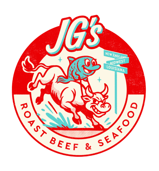
JG’s Roast Beef & Seafood brings together classic American flavors from across the country in one distinctive restaurant concept. Inspired by Midwestern roast beef, New England seafood, and Louisiana shrimp, the brand celebrates familiar regional favorites with a personality all its own.
Green Group Studio developed a bold, character-driven restaurant identity influenced by 1920s-inspired roadside Americana, vintage dining culture, and classic drive-in aesthetics. The result gives JG’s a nostalgic yet energetic presence, along with a flexible foundation for future restaurant concepts.
A Recipe for Retro
The project began with a custom mood board exploring vintage restaurant signage, retro typography, classic illustration, nostalgic color palettes, and early American roadside culture. Although the mood board is not displayed because it incorporated third-party reference imagery, it helped establish a focused creative direction before logo development began.
The selected palette combines softly faded patriotic hues, including cherry red, creamy white, and soda-fountain blue. These colors were paired with hand-drawn illustration and playful, retro-futuristic typography, creating a balance between 1920s-inspired charm and an optimistic, forward-looking personality.
A Logo That Steers the Brand
The finished logo brings the concept to life through an illustrated bull and fish, representing the restaurant’s signature combination of roast beef and seafood. The characters were also inspired by the personalities of the founder’s children, Dani and Dylan, adding a personal dimension to the identity. Their names are subtly hidden within the illustration as an Easter egg for those who take a closer look.
A crossroads sign reinforces the idea of iconic regional American foods meeting in one kitchen. The circular badge, distressed texture, nostalgic palette, and retro-futuristic lettering give the identity the presence of a vintage roadside restaurant sign.
Green Group Studio developed clean, distressed, one-color, two-color, tagline, and alternate logo configurations to support a wide range of applications. A concise brand guide documented the approved colors, typography, logo variations, and usage standards, creating a consistent foundation for signage, apparel, packaging, and marketing.
Serving the Brand Everywhere
The identity was extended across physical and promotional applications to show how the brand could live beyond the logo. Interior graphics, apparel, branded packaging, and environmental elements carry the same faded patriotic palette, vintage personality, and illustrated character throughout the customer experience.
These applications demonstrate how the brand can remain recognizable and cohesive across restaurant locations, takeout materials, merchandise, and marketing campaigns.
A Calling Card with Character
The business card design translates the JG’s identity into a compact and professional piece of branded collateral. Multiple front and back arrangements were explored to balance the illustrated logo, vintage-inspired styling, contact information, and overall readability.
The final production-ready design maintains the personality of the broader identity while providing a clear and memorable introduction for investor, franchise, vendor, and business-development conversations.
More Client Spotlights
We try not to play favorites, but we love some of our work too much not to share!


